
Yagyu-No-Sho is a traditional Japanese onsen inn with a rich cultural heritage. This redesign aimed to modernize the website to provide a seamless, responsive user experience that respects the ryokan’s serene atmosphere. The focus was on improving clarity, navigation, and visual consistency while preserving the inn’s authentic feel.
The primary goals were to enhance the website’s usability and accessibility by creating a clear navigation structure, making the site fully responsive across devices, and strengthening the visual design to reflect the peaceful and refined nature of the ryokan. Key objectives included simplifying the booking process and ensuring easy access to important information.
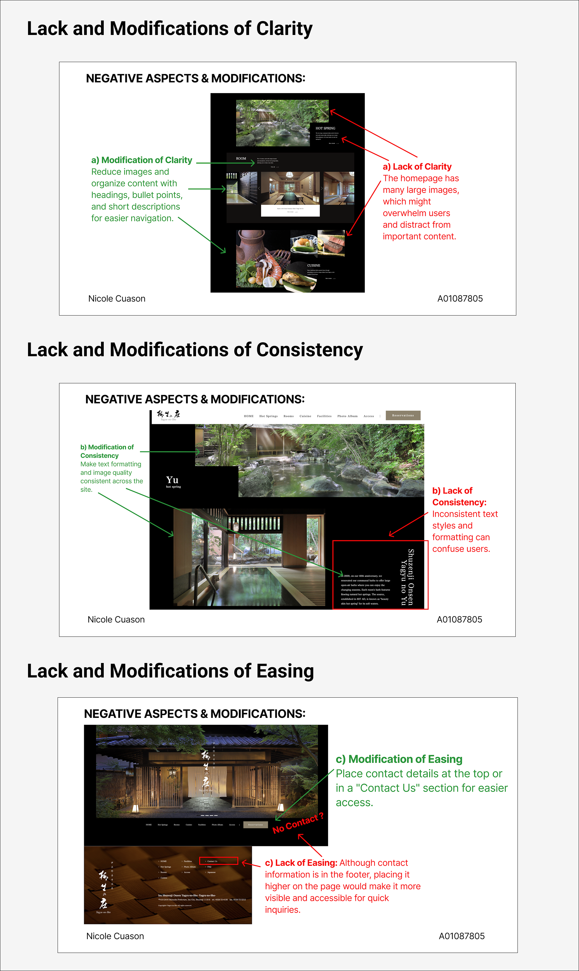
A comprehensive review of the original Yagyu-No-Sho website was conducted to evaluate how effectively it adhered to UX laws and UI principles. Below are categorized screenshots with annotations that highlight both strengths and areas for improvement, along with proposed design modifications.
The following screenshots demonstrate interface elements that were successfully aligned with UX principles. Each includes embedded snippets explaining why they were effective.

The UX evaluation identified key areas needing improvement, which guided the initial redesign approach. While the core modifications focused on improving clarity, consistency, and easing user access, the final UI elements evolved beyond these original suggestions to enhance the overall user experience further.
Specifically, the final redesign expanded upon the initial modification suggestions by restructuring content hierarchy for better readability, refining typography and color schemes to achieve visual harmony, and redesigning navigation and call-to-action elements to enhance user engagement and accessibility.
Initial prototypes focused on structuring the site content and navigation using basic HTML and CSS. While these versions established a foundation for layout and information architecture, they lacked responsiveness and polish. The prototypes helped identify areas needing refinement before moving to a high-fidelity design.


A comprehensive sitemap was created to organize the site’s content logically and streamline user journeys. This planning phase ensured that all essential sections — from baths and suites to transportation and reservations — were clearly defined and easily accessible.

Building upon the low to medium fidelity versions, the high fidelity prototype presents a polished, fully responsive design with refined typography, color schemes, and interactive elements. It showcases realistic visuals and improved navigation that closely simulate the final user experience.